
Materials & Care
Matte vs Glossy Stickers for Everyday Scenes
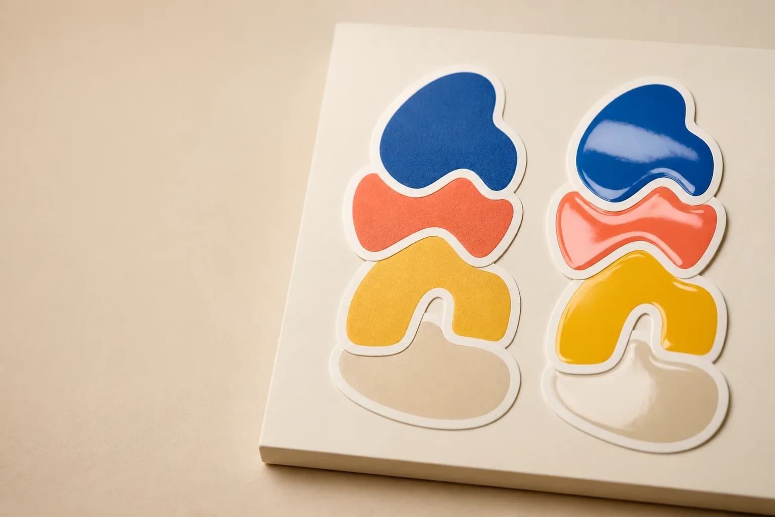
Compare matte and glossy stickers for laptops, bottles, journals, and character art. Pick a finish that supports your color, mood, and everyday scene.
Quick answer
Matte stickers feel soft, calm, and easy to pair with journals, laptop lids, and detailed art. Glossy stickers make saturated color and lively character designs pop with a polished look. Pick the finish that helps your everyday scene feel more like itself, whether that means quiet texture or bright energy. Start with the real place or feeling the sticker is meant to bring to life, then choose a scale that keeps the main idea clear. Character-led art works best when the silhouette reads before tiny details, while lifestyle stickers feel strongest when color and finish fit the objects people carry every day. For something truly personal, use the custom sticker studio to turn your own artwork, photo, or prompt into a design made for a favorite surface. Test the size there, keep room around the edge, and choose a finish that supports the mood instead of competing with it.
What makes matte vs glossy stickers feel personal?
Matte stickers feel soft, calm, and easy to pair with journals, laptop lids, and detailed art. Glossy stickers make saturated color and lively character designs pop with a polished look. Pick the finish that helps your everyday scene feel more like itself, whether that means quiet texture or bright energy. Start with the real place or feeling the sticker is meant to bring to life, then choose a scale that keeps the main idea clear. Character-led art works best when the silhouette reads before tiny details, while lifestyle stickers feel strongest when color and finish fit the objects people carry every day. For something truly personal, use the custom sticker studio to turn your own artwork, photo, or prompt into a design made for a favorite surface. Test the size there, keep room around the edge, and choose a finish that supports the mood instead of competing with it.
Begin with think about the lighting where the sticker will be seen. For people choosing a finish for custom and character art, that choice is more than a technical step: it decides how the sticker will feel when it becomes part of a desk, bottle, notebook, or gift waiting for a finishing touch. Look at the object from the distance people normally use it, then bring the design back to one clear focal point. A simple character, icon, or custom scene has room to connect when the scale, color, and border all support the same idea. Keep the important details strong enough to notice quickly, and let the quieter details make the design feel discovered over time. Step 1 is where the sticker begins to feel like a small piece of everyday storytelling.
Build the idea around a real everyday moment
Use these steps to move from a simple thought to a finish that supports the feeling of the design.
Begin with think about the lighting where the sticker will be seen. For people choosing a finish for custom and character art, that choice is more than a technical step: it decides how the sticker will feel when it becomes part of a desk, bottle, notebook, or gift waiting for a finishing touch. Look at the object from the distance people normally use it, then bring the design back to one clear focal point. A simple character, icon, or custom scene has room to connect when the scale, color, and border all support the same idea. Keep the important details strong enough to notice quickly, and let the quieter details make the design feel discovered over time. Step 1 is where the sticker begins to feel like a small piece of everyday storytelling.
Decide whether the art needs softness or sparkle becomes more useful when you imagine it in a real setting instead of only on a screen. In a clear matte and glossy laminate design, the surface, lighting, shape, and surrounding objects all influence the final feeling. Try placing a paper outline on the item, or picture the sticker next to the things that travel with it. Does the main subject still lead the eye? Does the color feel at home there? This is also a lovely place to bring in a soft sleepy character or a bright energetic mascot. A personal design does not need to be loud to be memorable; it just needs a clear reason to belong in the scene.
Treat match finish to the character's personality as a chance to make the custom sticker more recognizably yours. Choose the simplest version of the idea that still carries its emotion, then build outward only when each extra detail adds warmth, humor, or character. A small sticker has a limited stage, so a strong silhouette and a deliberate color pairing often say more than a busy collection of effects. If you are working from a photo or a prompt, pull out the feeling you want to keep rather than trying to copy every visual detail. That approach gives people choosing a finish for custom and character art room to create a design that can grow into future characters, scenes, and sticker packs.
A helpful way to explore look at color next to the real object is to compare two friendly variations side by side. Keep the main subject and size steady, then change only one thing: perhaps the border, finish, palette, or pose. Notice which version makes the object feel more alive. The right option should make a desk, bottle, notebook, or gift waiting for a finishing touch feel intentional, not over-designed. This kind of small experiment is especially useful for an original character because tiny changes in expression, color, or stance can make a big difference. Save the version that feels most like your idea, and use it as a visual anchor when you add new stickers later.
Begin with use one finish across a set when cohesion matters. For people choosing a finish for custom and character art, that choice is more than a technical step: it decides how the sticker will feel when it becomes part of a desk, bottle, notebook, or gift waiting for a finishing touch. Look at the object from the distance people normally use it, then bring the design back to one clear focal point. A simple character, icon, or custom scene has room to connect when the scale, color, and border all support the same idea. Keep the important details strong enough to notice quickly, and let the quieter details make the design feel discovered over time. Step 5 is where the sticker begins to feel like a small piece of everyday storytelling.
Mix finishes only when the contrast tells a story becomes more useful when you imagine it in a real setting instead of only on a screen. In a clear matte and glossy laminate design, the surface, lighting, shape, and surrounding objects all influence the final feeling. Try placing a paper outline on the item, or picture the sticker next to the things that travel with it. Does the main subject still lead the eye? Does the color feel at home there? This is also a lovely place to bring in a soft sleepy character or a bright energetic mascot. A personal design does not need to be loud to be memorable; it just needs a clear reason to belong in the scene.
- Think about the lighting where the sticker will be seen
- Decide whether the art needs softness or sparkle
- Match finish to the character's personality
- Look at color next to the real object
- Use one finish across a set when cohesion matters
- Mix finishes only when the contrast tells a story
Choose the details that support the scene
The most useful choices are quiet matte or vivid gloss, a cozy scene or a high-energy scene, consistent finish across a pack, how the character should feel in the hand. Let each one support the place where the sticker will live.
quiet matte or vivid gloss becomes more useful when you imagine it in a real setting instead of only on a screen. In a clear matte and glossy laminate design, the surface, lighting, shape, and surrounding objects all influence the final feeling. Try placing a paper outline on the item, or picture the sticker next to the things that travel with it. Does the main subject still lead the eye? Does the color feel at home there? This is also a lovely place to bring in a soft sleepy character or a bright energetic mascot. A personal design does not need to be loud to be memorable; it just needs a clear reason to belong in the scene.
Treat a cozy scene or a high-energy scene as a chance to make the custom sticker more recognizably yours. Choose the simplest version of the idea that still carries its emotion, then build outward only when each extra detail adds warmth, humor, or character. A small sticker has a limited stage, so a strong silhouette and a deliberate color pairing often say more than a busy collection of effects. If you are working from a photo or a prompt, pull out the feeling you want to keep rather than trying to copy every visual detail. That approach gives people choosing a finish for custom and character art room to create a design that can grow into future characters, scenes, and sticker packs.
A helpful way to explore consistent finish across a pack is to compare two friendly variations side by side. Keep the main subject and size steady, then change only one thing: perhaps the border, finish, palette, or pose. Notice which version makes the object feel more alive. The right option should make a desk, bottle, notebook, or gift waiting for a finishing touch feel intentional, not over-designed. This kind of small experiment is especially useful for an original character because tiny changes in expression, color, or stance can make a big difference. Save the version that feels most like your idea, and use it as a visual anchor when you add new stickers later.
Begin with how the character should feel in the hand. For people choosing a finish for custom and character art, that choice is more than a technical step: it decides how the sticker will feel when it becomes part of a desk, bottle, notebook, or gift waiting for a finishing touch. Look at the object from the distance people normally use it, then bring the design back to one clear focal point. A simple character, icon, or custom scene has room to connect when the scale, color, and border all support the same idea. Keep the important details strong enough to notice quickly, and let the quieter details make the design feel discovered over time. Step 4 is where the sticker begins to feel like a small piece of everyday storytelling.
- quiet matte or vivid gloss
- a cozy scene or a high-energy scene
- consistent finish across a pack
- how the character should feel in the hand
Keep the design clear, warm, and easy to enjoy
The strongest sticker ideas give one subject room to shine and let every detail support that feeling.
A common miss is assuming one finish is better for every design. It usually happens when the artwork is treated as a flat image instead of a small object that will live in a real scene. Slow down and return to the main purpose: a finish that supports the feeling of the design. Let the surface, scale, and focal subject lead the choice, then remove anything that competes with them. If the design is character-led, make sure the expression still reads before adding decoration. If it is a lifestyle sticker, make sure it feels at home beside the things people already love. Small changes at this stage can turn a busy idea into a sticker people want to keep. This is the kind of detail worth testing in variation 1.
A common miss is choosing before imagining the real surface. It usually happens when the artwork is treated as a flat image instead of a small object that will live in a real scene. Slow down and return to the main purpose: a finish that supports the feeling of the design. Let the surface, scale, and focal subject lead the choice, then remove anything that competes with them. If the design is character-led, make sure the expression still reads before adding decoration. If it is a lifestyle sticker, make sure it feels at home beside the things people already love. Small changes at this stage can turn a busy idea into a sticker people want to keep. This is the kind of detail worth testing in variation 2.
A common miss is using reflections to hide weak color choices. It usually happens when the artwork is treated as a flat image instead of a small object that will live in a real scene. Slow down and return to the main purpose: a finish that supports the feeling of the design. Let the surface, scale, and focal subject lead the choice, then remove anything that competes with them. If the design is character-led, make sure the expression still reads before adding decoration. If it is a lifestyle sticker, make sure it feels at home beside the things people already love. Small changes at this stage can turn a busy idea into a sticker people want to keep. This is the kind of detail worth testing in variation 3.
A common miss is mixing finishes without a reason. It usually happens when the artwork is treated as a flat image instead of a small object that will live in a real scene. Slow down and return to the main purpose: a finish that supports the feeling of the design. Let the surface, scale, and focal subject lead the choice, then remove anything that competes with them. If the design is character-led, make sure the expression still reads before adding decoration. If it is a lifestyle sticker, make sure it feels at home beside the things people already love. Small changes at this stage can turn a busy idea into a sticker people want to keep. This is the kind of detail worth testing in variation 4.
- assuming one finish is better for every design
- choosing before imagining the real surface
- using reflections to hide weak color choices
- mixing finishes without a reason
Bring an original character or custom detail into the mix
A memorable sticker can be as simple as a soft sleepy character or a bright energetic mascot. Give it a clear role in the scene and let it feel like your own.
Treat a soft sleepy character or a bright energetic mascot as a chance to make the custom sticker more recognizably yours. Choose the simplest version of the idea that still carries its emotion, then build outward only when each extra detail adds warmth, humor, or character. A small sticker has a limited stage, so a strong silhouette and a deliberate color pairing often say more than a busy collection of effects. If you are working from a photo or a prompt, pull out the feeling you want to keep rather than trying to copy every visual detail. That approach gives people choosing a finish for custom and character art room to create a design that can grow into future characters, scenes, and sticker packs.
A helpful way to explore a desk, bottle, notebook, or gift waiting for a finishing touch is to compare two friendly variations side by side. Keep the main subject and size steady, then change only one thing: perhaps the border, finish, palette, or pose. Notice which version makes the object feel more alive. The right option should make a desk, bottle, notebook, or gift waiting for a finishing touch feel intentional, not over-designed. This kind of small experiment is especially useful for an original character because tiny changes in expression, color, or stance can make a big difference. Save the version that feels most like your idea, and use it as a visual anchor when you add new stickers later.
A quick custom sticker checklist
Before you make the final version, confirm the surface, size, main subject, clear matte and glossy laminate, and the mood you want people to feel.
a simple real-surface test becomes more useful when you imagine it in a real setting instead of only on a screen. In a clear matte and glossy laminate design, the surface, lighting, shape, and surrounding objects all influence the final feeling. Try placing a paper outline on the item, or picture the sticker next to the things that travel with it. Does the main subject still lead the eye? Does the color feel at home there? This is also a lovely place to bring in a soft sleepy character or a bright energetic mascot. A personal design does not need to be loud to be memorable; it just needs a clear reason to belong in the scene.
Begin with a saved copy of the artwork and layout. For people choosing a finish for custom and character art, that choice is more than a technical step: it decides how the sticker will feel when it becomes part of a desk, bottle, notebook, or gift waiting for a finishing touch. Look at the object from the distance people normally use it, then bring the design back to one clear focal point. A simple character, icon, or custom scene has room to connect when the scale, color, and border all support the same idea. Keep the important details strong enough to notice quickly, and let the quieter details make the design feel discovered over time. Step 2 is where the sticker begins to feel like a small piece of everyday storytelling.
- The everyday surface is chosen
- The main subject reads clearly
- The size suits the available space
- The finish supports the mood
- The character or custom detail feels original
- The design is ready to become part of a sticker story
Ready to make it yours?
Choose a favorite object, a clear main subject, and a mood that feels like you. Then bring your artwork, photo, or prompt to our custom sticker studio to shape a one-of-a-kind sticker for everyday life.
StickerMigo journal
Made for everyday stories
Updated with fresh ideas for custom, lifestyle, and character stickers.
